Retterspitz: Packaging for Healing and Care Products
Reinterpreting Tradition
The recipe for distinctive brands lies in an authenticity that you can feel. The ability to determine the relevant values, to compress them and to reproduce them in visual form is the mark of an agency that truly knows its stuff.
To define the core of the Retterspitz brand, we first need to look back at its history. After all, this is a company that has constantly evolved over the decades while always remaining true to itself. Margarete Riegel, who was born in 1851, was given a skincare remedy by her first husband Georg, who acquired it from a doctor. She immediately recognised the many possible uses of its recipe. As a young widow, she produced the remedy herself and organised sales and distribution until a new man arrived in her life: Friedrich Retterspitz. With his help, she carried on producing her medicinal water from 1895. Six years later, the product was finally registered under the brand name that translated as ‘Universal Healing Compress and Bath Essence by Margarete Retterspitz’.
After she moved to Switzerland and died some time later, the product disappeared from the German market until pharmacist Hans Scheck rediscovered its potential and acquired the formula. From then on, 1902 was seen as the birth of the modern Retterspitz brand in Nuremberg. When Scheck’s son Hermann took over the company, Retterspitzwasser (Retterspitz Water) for external application was joined by a new product: Retterspitz Innerlich (Retterspitz Internal) for internal use. Not even the complete destruction of the company in the Second World War was enough to remove the established and very popular product from the market entirely. Production was soon up and running again, courtesy of Dr. Gerhard Valet, doctor and grandson of the company’s founder, who built up the product range, adding further products based on the original recipes. An unswerving commitment to top quality and tolerability have kept the pioneering spirit of Margarete Riegel alive throughout the generations.
Visible Values
Healing, caring, wellbeing – these are the three key values under which brothers Markus and Florian Valet have been steering the fortunes of Retterspitz since 2005. As Markus Valet explains: “The basis for everything is our outlook as a traditional family company. This covers a wide range of areas: the internal workings of our organisation, how we see ourselves as a family from a personal and working perspective, and how we communicate. We show appreciation to all of our employees and interact with them on an equal footing.”
This emotional value is also transferred to the products and the brand’s public image. Markus Valet has no qualms about combining deeply rooted tradition with modern-day expectations – on the contrary, he feels they fit very well together: “We don’t develop our products because of any pressure to come up with something new – this means that we don’t follow trends but remain true to ourselves.” Needless to say, despite the company’s good name, it is necessary to reflect the preservation of its DNA and communication of its traditional values – that are more in demand than ever today – in a way that fits with the modern world. After a complete relaunch over ten years ago, this task has been entrusted to the experts at the FYFF Group since 2019. Also run by its owner and with offices in Nuremberg and Berlin, the agency has already infused numerous brands with its unique authentic spirit.
Quality in Detail
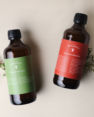
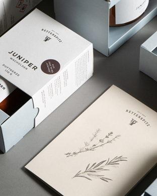
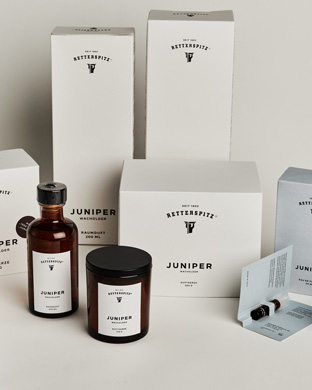
As FYFF was “lucky enough to find a well-thought-out corporate design already in place”, it was just a matter of fine-tuning things: As well as softer, more approachable photographic visuals, placing new illustrative elements that lent a charming touch. And it was clear that a new kind of paper would be instrumental in subtly conveying the premium quality of the products. The offset paper that was previously used was replaced with Bio Cycle – because this ties in with the Retterspitz brand’s commitment to sustainability. As FYFF’s Creative Director Andreas Amtmann explains: “That was the ideal paper for us as it combines sustainability with an aesthetic look and a great feel.” Embossed with an individual surface pattern, all business stationery, communication media and some of the packaging adhered rigidly to this form from then on. The creamy off-white packaging provides a distinctive stage for the brand and also envelops the new wellbeing products like the newly launched perfume and room scent.
As Andreas Amtmann tells us: “When I print something today, it needs to be able to convey haptic, optical and intrinsic qualities that cannot be reproduced digitally. What makes it relevant is the overall experience I have when I am holding printed matter in my hand.” It is this relevance that Retterspitz products have to offer. Here, a commitment to top quality, sustainability and physical manifestation all enter a perfect symbiosis that can be felt clearly in pharmacies, at the Retterspitz flagship store and now also at the concept store run by high-profile retailer Andreas Murkudis in Berlin.
Markus and Florian Valet have been at the helm of the Retterspitz brand since 2005. We spoke to Markus Valet about values, materiality and his plans for the future.
Don’t you feel that you’re breaking with your tradition by introducing wellness products?
We don’t see anything contradictory about it. And our customers have no problem with us producing remedies and care products on the one hand and a room scent on the other. If you take a holistic, people-centred view, it’s not so easy to split up these areas.
Nonetheless, they still need to be marketed differently to customers. While I buy the skin balm in a pharmacy, I would be more likely to look for the room scent in your flagship store…
Pharmacies are actually our primary POS because we make products that need to be explained to customers – you wouldn’t get this kind of one-to-one advice in a drugstore. And in opening a flagship store, we certainly didn’t want to create more competition. The aim here is just to present the entire Retterspitz world and to provide customers with the best possible individual consultation.
Was it important for you to have a reduced, uncluttered look?
For our relaunch, we wanted to retain a certain traditional look that was consistent with pharmacies – which just happened to be seen as being very modern as well. We have always had a pharmaceutical background. With FYFF, we have been making moderate changes for some time, adjusting minor parameters that still have a visible impact.
This also includes switching to paper by Gmund. When choosing your business partners, is it important for you to be on the same page when it comes to quality and sustainability?
Absolutely. For me personally, that is more important than the price, which of course has to be discussed at some point as well. Particularly when it comes to long-standing cooperations with owner-run companies that are bought up by corporate groups, you get an immediate sense of how the ‘room temperature’ changes very quickly. Having had this experience, these soft factors are far more important to me than they used to be.
In your experience, how much of a role does packaging play in generating sales?
I think it plays an essential role. After all, we humans initially judge each other by the way we look before we get properly acquainted. The same is true of products: the first impression is based on outward appearance. The product needs to win over potential customers at this point – which is where attractive premium packaging comes in. This is a form of non-verbal communication that manufacturers can use to define the worth of the actual product.
Sustainability is something that is very close to your heart…
Absolutely. We had sustainable business practices before the term even existed. One key factor is that we mainly source from within Germany, so the coronavirus crisis didn’t affect our production at all.
The concept also led to a change in the paper used…
Yes, needless to say, the sustainable thinking that is rooted in our company extends to the paper we use as well. At this time, the new Bio Cycle series had just come out and as its haptic in particular was an excellent fit, we gradually switched all of our printed materials. We had our envelopes and labels produced using Bio Cycle too. And when we were starting out with our scent, we decided to have our own surface pattern embossed on the paper for this series – to make it look even more elegant. This is a special production that is used only for the scent series.
And now we have a new room scent that is the perfect fit for it. This is an important aspect too – we have no doubt that Gmund will still be around in three years’ time and that we will be able to use the same paper with exactly the same structure.


